image one by Alexis Marcou.
the thing i like about this image is how from a distance it looks so graphical and computer generated; yet if you actually look properly you can see that it's actually a graphite pencil drawing. The angles of the shapes created through the various tones create this graphical futuristic appearance; it helps to enforce the fact that different images can be perceived in different ways.
image two by David Fullarton
David Fullarton is definitely one of my favourite illustrators, i love the combinations he creates through layered papers and some quite surprisingly intricate pencil drawings. The work is very contemporary and Fullarton mixes humour with the harsh reality of daily experiences.
image 3 by Greg Eason
Such an intricate graphite pencil image that it looks so easily like a photograph. I chose this image as the way that the image has been created, develops an interesting combination of some classical elements - the pencil tones - alongside the more contemporary workings of the large black rectangle in the centre. I feel that this is a good example of how any image can be transformed into a more modernised image.
image four by Ward Zwart
I for some reason really like drawings of bears, i think the faces are always drawn with such character and the fur has so much detail. The facial expression of this one in particular is quite funny, it looks a little like he is smiling. The tones in this drawing are all quite earthy neutral colours; the mark-making really emphasises the weight and volume of the hair too. I really like this style of contemporary design too.
image five by Tom Edwards
Image five is of a very contemporary representation of a landscape portrayed through a graphical style. Edwards has used actual photographs, perhaps colour film photos due to the richness of the images; and combined this with solid colour blocks and some pen detail. The shapes are quite abstract within the image yet are clear representations of the grass-land and surrounding areas. Despite the plain background the image still appears balanced and inviting.
image six by dimitri tyskalov.
Although technically a sculpture the photographed composition and lighting used really enhance the subject here. Tyskalov has sculpted a skull onto an apple. The contrast between the flesh and skin works really well; and the decision to leave the skin on the teeth works really well i feel. Also the way that the apple is beginning to age works to an advantage here as the tones become more deepened and enhanced.
image seven by Lizzy Stewart
I've never seen this concept before of taking old photographs and then re-producing them in a contemporary style. Stewart has used different mark-makings and cross-hatching to develop the set of old portraits. The choice to use the varying warmed tones works really fantastically to redevelop the rich aged appeal of dated images.
image eight by nathan ford
I recently saw this painting in the national portrait gallery. It really stood out to me among the rest at the exhibition; it's not the most appealing to look at but the composition and whole style of the painting really interested me. Earthy strong colours are used within the painting and create some really beautiful tones, with the darker areas around the eyes really drawing you in. I also like how the image of the boy fades away past the shoulders, allowing your mind to develop the rest of the image.
image nine by Jared Nickerson
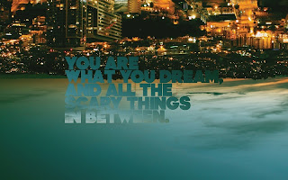
This graphical image really translates and communicates the person's state of mind; of them being in a dream-state and feeling upside-down from the world, confusion. The idea of flipping an image of a city upside down is quite unusual so is immediately attention grabbing. The text has been well-considered and is developed from the tones of the sky so is still strongly apparent yet has a more subtle presence; preventing it from appearing to over-complicated i feel.
image ten
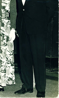
ok so for my final image i've chosen something a bit different. my task was to find ten images that interest me. I have chosen this image to show how differently things can be perceived and how sometimes you look past what's really there. i got shown this image a while ago, it appears to be a normal family photo, in fact from a wedding, from what i understand this is the original image, no tampering has been done.
N.B. the small head by the woman's hand and the feet by the man's shoes.
Or is it the man holding the woman's scarf or shawl hanging to resemble feet. Is the face in fact just the man's shirt cuff.
Perception is everything.


